Dragon X Chan
DXC - Building a Brand as Fierce as His Fighting Style
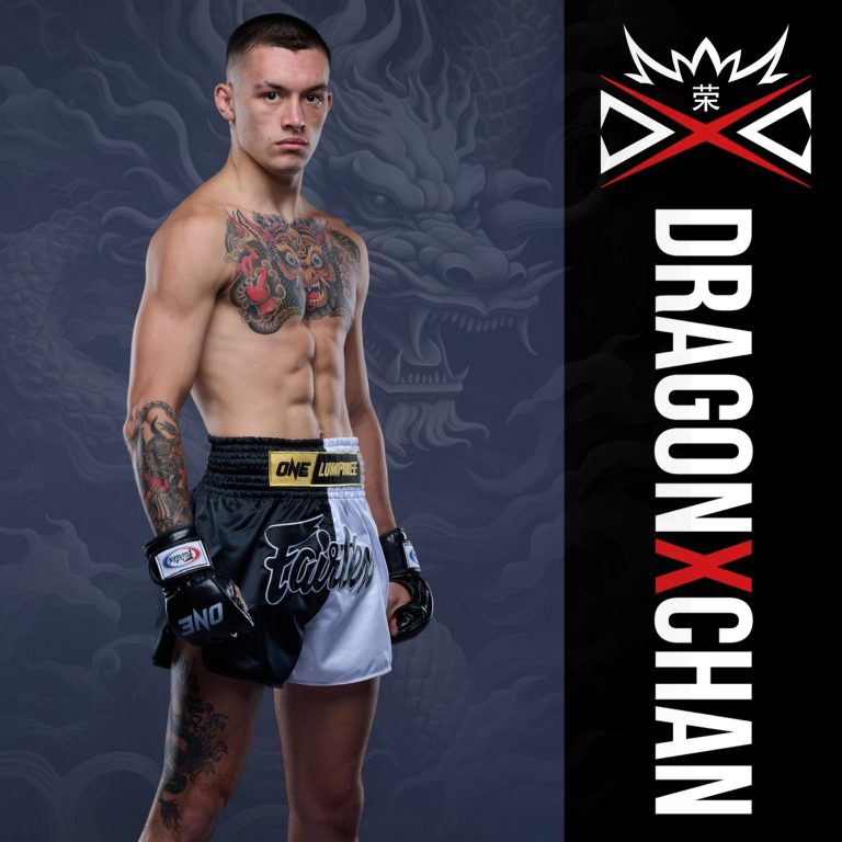
When Edinburgh Muay Thai fighter Logan “Dragon” Chan wanted a brand that hit as hard as his elbows, he came to us. We created a full identity that captured his intensity, his heritage, and his drive to dominate - both in the ring and online.

The Challenge
Logan was already building a name in the fight scene, but no solid brand presence. He needed something that felt professional, marketable, and recognisable - from event posters and team t-shirts to sponsorship deals.
Our goal was simple: make “Dragon Chan” a name promoters and fans remember, and sponsors want to get behind.
Our Approach
We started with the fighter himself: bold, technical, exciting to watch.
From there, we built a black and red identity inspired by traditional martial arts tones, with dragon imagery to match his nickname.
We designed:
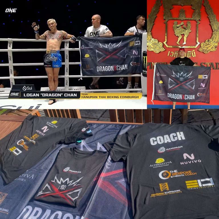
- A clean, powerful logo system for use across digital and print.
- Merch designs (t-shirts, banners, and corner flags) that stand out under fight lights.
- Sponsor layouts that balanced visibility and style.
- A promo strategy and sponsorship proposal deck to attract and manage new partnerships.
The Result
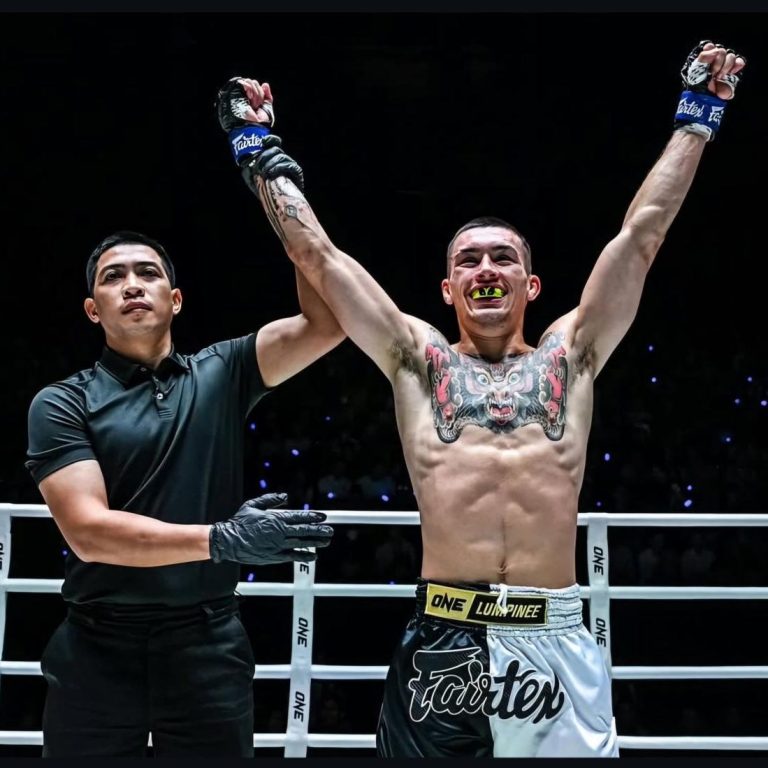
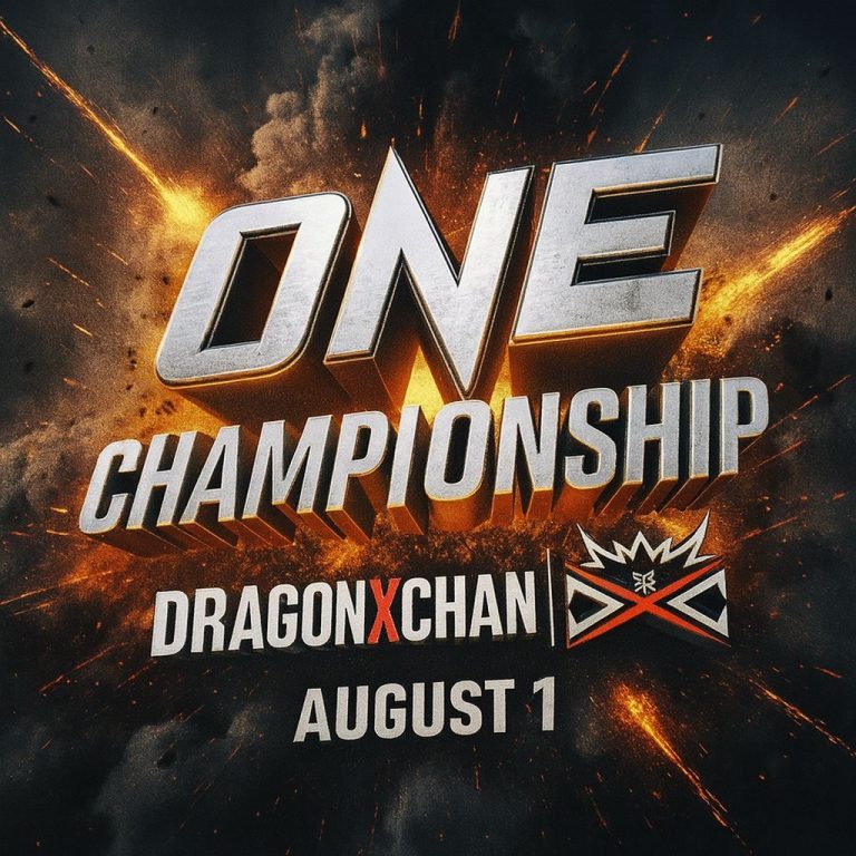
The new brand gave Logan a professional edge that matched his performances. He’s since headlined events across Scotland, and the home of Muay Thai, Lumpinee Stadium in Bangkok, Thailand. Featuring on Muay Thai's top promotion, ONE Championship, shown live on Sky Sports.
He has secured new sponsors, and continues to build his fanbase - all while flying the Dragon X Chan brand with pride.
If you’ve got a brand that’s ready to fight above its weight, let’s talk.
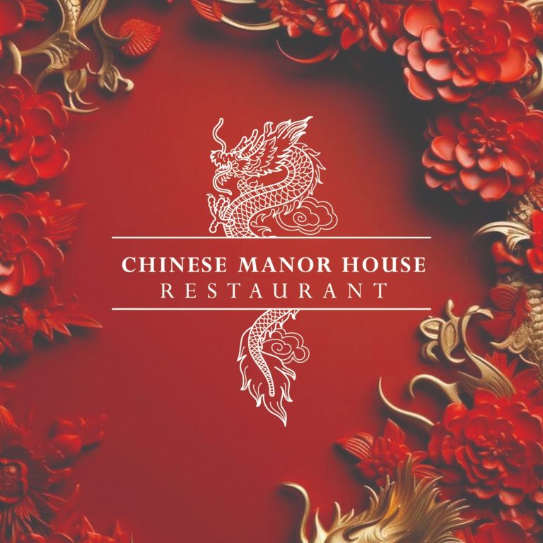
Chinese Manor House Restaurant
Evolving a Local Favourite into a Recognisable Brand
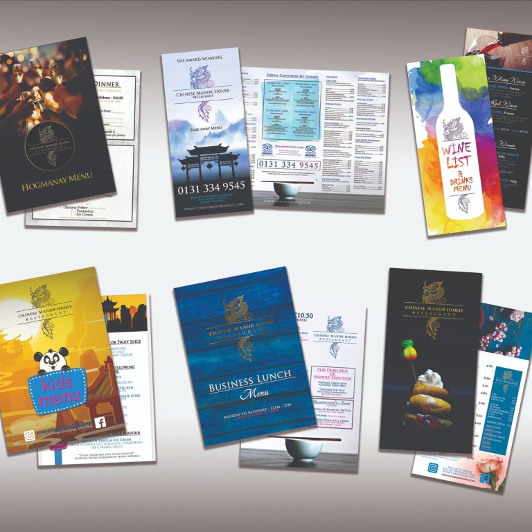
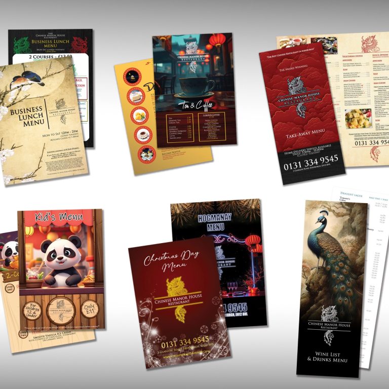
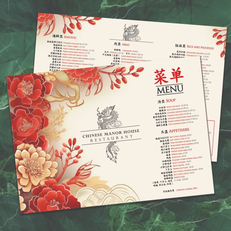
Over the years we’ve designed:
- Takeaway and sit-in menus
- Kids menus, dessert menus, and wine lists
- Seasonal menus
- Gift vouchers, signage, and social media graphics
Turning a simple menu update into a decade-long brand transformation.
What started as a straightforward request to update menu prices became a long-term partnership built on trust, consistency, and design that truly represents the restaurant’s character.
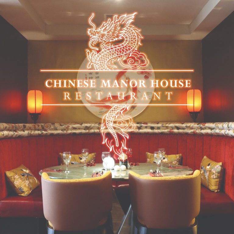
Chinese Manor House is an established Edinburgh restaurant known for its warm service, generous portions, and loyal local following. But their visuals didn’t match their reputation -until we stepped in.
The Challenge
The restaurant already had a strong name and loyal customer base, but its design materials felt disconnected - plain menus and visuals with no real sense of identity.
They needed a look that reflected their quality, atmosphere, and authenticity -something unmistakably Chinese Manor House.
Our challenge was to take what existed, refine it, and slowly build a brand that felt cohesive, professional, and proud of its heritage.
Our Approach
It began with something small: redesigning their sit-in menus. The new design instantly elevated their presentation.
That success led to a complete overhaul of their takeaway menus, which we redesigned with a premium yet approachable aesthetic inspired by their interior décor. From there, the brand started to grow.
When the restaurant underwent a major renovation, we evolved the entire brand again - ensuring every design detail complemented the new interior and reinforced the Chinese Manor House identity.
The Result
Today, Chinese Manor House has a polished, cohesive visual identity that customers instantly recognise - one that reflects both its authenticity and its elevated dining experience.
What began as a small print job turned into a complete brand evolution, and a lasting creative partnership that continues to grow after nearly a decade.
Cooking up something special? Let’s make sure your brand looks the part.
Glen Appin of Scotland
Reinventing
Scottish Tradition
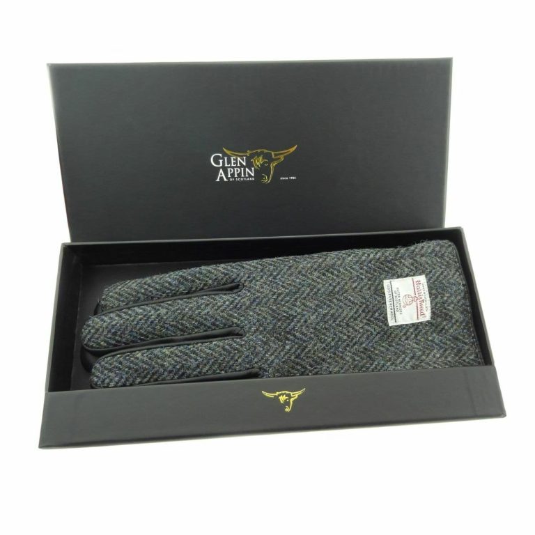
Over a decade designing:
- Complete company rebrand
- Logo design
- Design for print and packaging
- Exhibition work and Advertisements
The Journey
Rebranding Glen Appin of Scotland in 2012 was a turning point that transformed the company from a traditional Scottish gift business into a vibrant, recognisable brand. While its roots date back to 1903, the company needed a modern identity that honoured its heritage while appealing to new audiences. Through refined branding, updated packaging, and fresh marketing materials, Glen Appin was given a contemporary look that still retained its authenticity.
This transformation extended across catalogues, packaging, adverts, and digital platforms, ensuring a consistent, high-quality image.
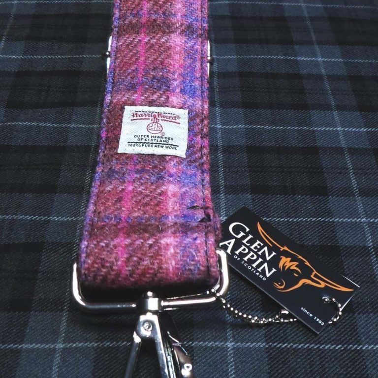
The Result
The introduction of bold typography, a distinctive visual style, and strategic storytelling strengthened brand recognition. As a result, Glen Appin’s Harris Tweed bags, accessories, and Scottish gifts became more desirable, expanding into new markets and securing its position as a leading name in Scottish heritage products.